
Keeping track of projects doesn’t have to be complicated. There are a variety of tools that will give you visibility into what has been completed and what still needs to be done at a quick glance.
For example, you could use a Gantt chart to track your projects. While Gantt charts are great for both Waterfall and Agile methodologies, they have some downsides – they can be bulky and bloated with too many details as well as tedious to build.
A better alternative to Gantt charts is burn up charts. But what is a burn up chart, and how do you create one?
Agile teams use burn up charts to track a project's progress over time in a simple and clear graph. That way, your team can easily check the status of tasks at a glance. In this page, we’ll discuss what a burn up chart is, why you should use them, and how to create one for Agile project management.
Definition of a burn up chart
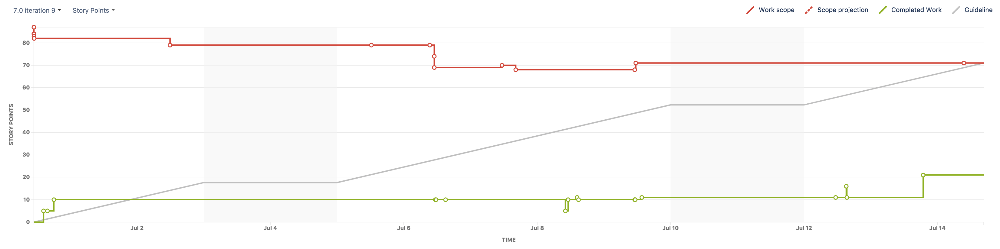
A burn up chart is a roadmap that plots your work on two lines along a vertical axis. One line indicates the entire workload for the project. The other depicts the work completed thus far. When you finish the project, the two lines meet.
You can use your preferred measurement units, such as story points, issue counts, or estimates. The horizontal axis represents the timeline of the entire project.
These charts are great if you're knee-deep in an Agile project management framework. They're an accessible, at-a-glance overview. You can even create burn up charts in Scrum and Agile planning to help you and your team stay on task.
Why use a burn up chart?
Here are some benefits of using a burn up chart for Agile and Scrum projects:
- Clearly indicates progress: One advantage over Gantt charts—you can read burn up charts at a glance. They aren't as complex or confusing as a Gantt chart. And unlike a burn down chart, a burn up shows work completed in an upward graph with more detail. It shows both total work and work completed.
- Facilitates forecasting: Burn up charts allow your team to determine an approximate completion date. You can work backward to establish your Scrum metrics or benchmarks.
- Highlights scope changes and manages scope creep: Unlike a burn down chart, you can easily mark any scope changes and match them to the team's progress. This helps you mitigate any scope creep before it gets out of hand.
- Permits early detection of issues: Burn up charts let you mitigate problems before they become massive headaches.
- Provides transparency for everyone: Burn up charts are easier to read and facilitate complete transparency between you and your team, helping you make better project decisions. If you're working with clients, transparency is great for building trust.
When to use a burn up chart
Burn up charts are great for your Scrum projects and sprint planning. You can use them to visually represent your sprints so you can see the entire project's scope. You can then track that against the progress of completed work or what still needs to be done.
Burn up charts are particularly helpful when scope creep happens. Any changes in scope can kill a project's momentum, especially with Agile workflows. You can use your burn up chart to manage creep and mitigate delays.
You can also track and match the scope changes to your team's workload. If you used a burn down chart, you wouldn't be able to see the impact of any scope creep. You might think the project was proceeding as it should.
But with these changes apparent in a burn up chart, you can adjust or reduce workload and allocate resources as needed. Your team can then figure out quick solutions to the additional requests.
How to create a burn up chart for Agile project management
Setting up a burn up chart is easier than creating a Gantt chart. We’ll take you through the step-by-step process of creating one for your team.
Before creating a burn up chart, you need to know the project's scope. This helps your team identify all the necessary tasks and estimate your timeline, making it easier to forecast how many sprints you'll need.
Here’s how to create a burn up chart in Jira:
- Click Projects. You'll find this in the navigation bar. Select the relevant project you want to create the chart for.
- Click Reports. Then select Burn up chart.
- Choose your measurements. Select a different sprint or measurement for the vertical axis, and click the dropdown menu.
- Establish the x-axis. Place the x-axis along the bottom of your chart. Once again, this is the timeline of the entire project. It'll allow you to see the time it takes to complete tasks. And it helps chart sprints.
- Determine the y-axis. This axis goes vertically across the chart. Here’s where you'll mark the work completed. This measurement can be story points in whatever increments you deem appropriate.
- Pick your line colors. Remember, these lines represent work completed and the workload of the entire project. Make these lines different colors. Red and green work best.
Effectively track the progress of any project with a burn up chart
If you want to stay ahead of problems, a burn up chart might be best for you and your team. It will keep you agile and help you track sprints. You'll also be more transparent in monitoring the project's workload.
Burn up charts are great with an Agile project management tool, such as Jira. Set up your scrum team’s next project quickly with Jira’s Scrum template and leverage the burn up chart for improved project tracking.
Jira also comes with dozens of out-of-the-box reports that help teams identify trends, follow the status of every team's projects, and predict future performance.
Jira’s agile metrics, insights, and reports make it much easier to plan your next project and allow the team to collaborate more easily with a smooth flow of information, resulting in less context-switching and fewer headaches.
Burn up chart: Frequently asked questions
How do you read a burn up chart?
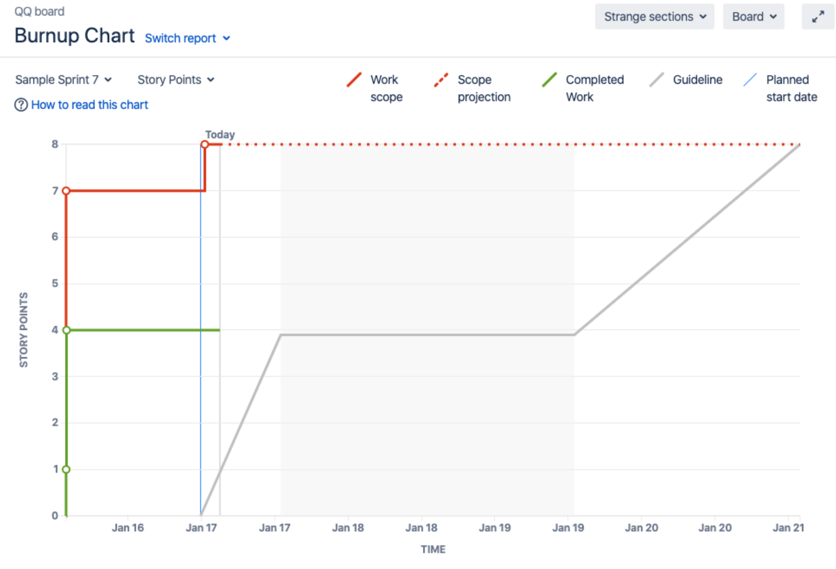
Let’s start with an example of a burn up chart in Jira.
Here's how you would interpret the chart:
- The vertical axis is the amount of work, represented in various ways, such as story points, issue count, or estimates.
- The horizontal axis represents the timeline, measured in days.
- The red line is your work scope and scope projection. You can use this to identify any scope creep.
- The green line is completed work so far in the project.
- There's an extra line in gray, which represents the ideal pace of your team's progress.
What is the difference between a burn up chart vs. a burn down chart?
While they sound similar, burn up charts and burn down charts are nothing alike. Here are the major differences between the two:
- Burn up charts track your wins. A burn down chart marks the amount of work remaining, whereas a burn up shows how much work the team has completed. So the line on a burn down chart decreases as your team finishes the work.
- You can't track changes on burn down charts. Here’s where burn down charts are at a disadvantage. They don't show changes in the project. And you might falsely think the project is proceeding as it should. A burn up chart allows for more detail, and you can easily track any changes to the scope.
- Burn ups highlight scope creep. On a burn up chart, you can add any scope creep and account for its impact on the project. You'll be better informed so you can take appropriate action.
Here are some guidelines for choosing which chart to use:
- Burn downs are perfect for a project with a fixed scope. It's rare for a project to have an accurate, well-defined scope. But if it does, use a burn down chart.
- Burn ups are great for Agile project management. Burn up charts track progress but are flexible and adjust to any changes during a project. This makes them a better option for Agile project management.
Can burn up charts be used in Agile or Scrum projects?
Yes. These charts are perfect for Agile project management and Scrum teams. They allow you to forecast better, monitor scope creep, and track progress. Scrum teams will be more agile as problems arise, adapting and continuously improving. They’re also great for tracking the team's efficiency from one sprint to another.
Easily create burn up charts with Jira.